LAVENDER
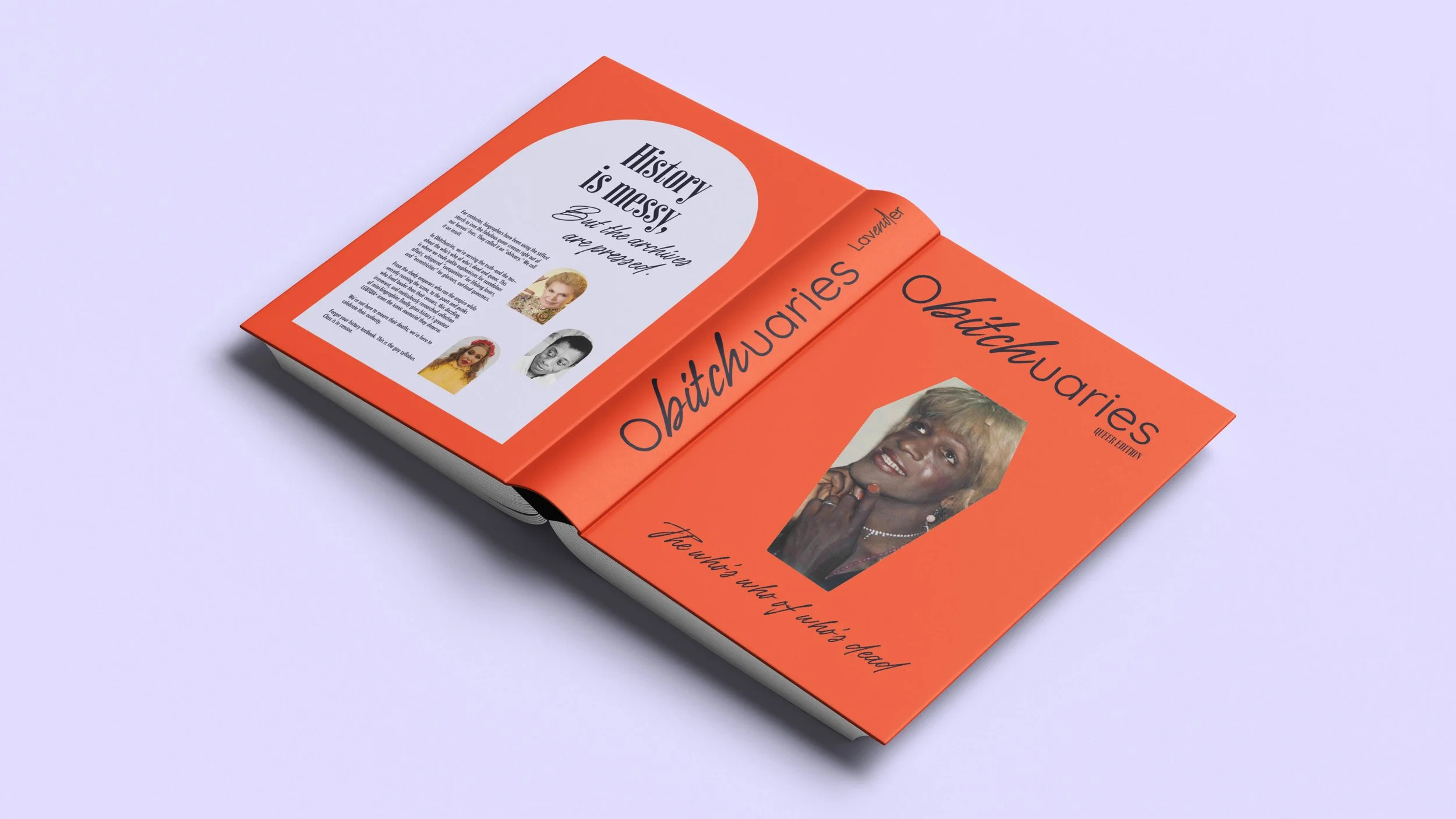
The Problem: End-of-life care and funeral services remain deeply traditional, often lacking cultural competency and sensitivity toward LGBTQIA+ individuals. The industry required an empathetic, dedicated brand identity that guarantees dignity, respect, and tailored memorial services for the queer community during critical end-of-life moments.
The Strategic Insight: Funeral branding typically relies on somber, clinical, or overly religious imagery that can feel alienating. To create an authentic space for mourning and celebration, the strategy paired universal iconography with deep-rooted queer history. Utilizing lavender—a color historically reclaimed by the community—alongside vibrant Dia de los Muertos orange and a grounding, slate-black hue created a bridge between deep emotional mourning, heritage, and celebratory remembrance.
The Execution:
Brand Identity & Strategy: Established the visual direction, color system, and messaging framework centered on dignity, queer history, and inclusivity.
Color & Graphic System: Paired historical lavender and deep mourning tones with Day of the Dead orange accents, utilizing clean, modern vector iconography (gravestones, coffins, urns) for immediate category recognition.
Print & Touchpoints: Designed memorial service collateral, stationery, informational booklets, and administrative touchpoints crafted to handle delicate conversations with warmth and clarity.
Packaging & Keepsakes: Developed sensitive, high-touch physical packaging systems for urns and commemorative keepsakes.
The Result: Produced a deeply resonant, culturally nuanced brand system that demonstrates how design can transform traditional, high-friction industries. The project highlights a high-level mastery of emotional visual storytelling, inclusive strategy, and system-level execution.
REST IN PEACE, HENNY!